
The Role of Designer Branding in Building Trust

Designer branding is the strategic practice of converting positioning into visual and experiential systems that build recognition, trust, and measurable revenue impact. It goes well beyond logo design or color selection. The role of designer branding is to translate what a company believes, promises, and stands for into every touchpoint a customer encounters — from a homepage to a shipping box.
The business case is concrete. A 2019 Lucidpress survey found that consistent branding can lift revenue by up to 33%. Separately, web perception research clocked first visual impressions at roughly 50 milliseconds — faster than a conscious thought. Those two figures alone define the stakes.
The primary outputs designers are responsible for:
- Visual system: logo family, palette, typography, imagery direction, and motion
- Design code: the documented rules that govern how those elements behave together
- Governance: the guidelines, tokens, and ownership structures that keep the system consistent at scale
Table of Contents
- Why does designer-led branding drive business outcomes?
- How do designers act as strategic interpreters?
- How do you preserve brand trust as teams and channels scale?
- How do you measure the impact of designer branding?
- What should you capture before starting brand work?
- How do these principles apply to a luxury e-commerce experience?
- Key Takeaways
- Why most brand projects fail before the first concept is shown
- Mytotaltake brings brand-aligned curation to every product category
- Useful sources and further reading
Why does designer-led branding drive business outcomes?
Design translates strategy into trust, and trust shortens decision cycles. When a buyer encounters a brand for the first time, they are not reading copy — they are reading signals. Color, type weight, image quality, and layout hierarchy all communicate competence or its absence before a single word registers.
The 50-millisecond impression window means that visual credibility is not a nice-to-have layer added after product-market fit. It is the first filter a potential customer applies. Pair that with the finding that consistent presentation across channels can increase revenue by up to 33%, and the commercial argument for investing in brand design becomes difficult to dismiss.
“The best start-ups treat brand as infrastructure, not marketing. A clear point of view drives differentiation, attracts the right talent, and signals to investors that the founders understand their customer.”
— Design Week
Early-stage companies that invest in brand clarity tend to grow faster and command stronger valuations — not because the logo is beautiful, but because consistent execution signals attention to detail across the entire organization. Brand quality tells investors and customers the same thing: these people sweat the details.
How do designers act as strategic interpreters?
Designers are not stylists. Their core function is to convert positioning and business constraints into repeatable visual and interaction rules — a job that requires understanding revenue models, audience psychology, and competitive context before touching a single frame.
The workflow that produces defensible brand work follows a clear sequence, a process aligned with effective Tools & Home Improvement marketplace management practices:
- Pre-concept perception work: Run image-sorting exercises and boundary-defining workshops to surface what the brand should feel like — and what it must never feel like. Structured pre-concept work reduces failed directions and clarifies stakeholder assumptions before design begins.
Pro Tip: Document the reasoning behind every major visual decision in a short “decision log.” When a stakeholder later asks “why is the type so large?” you have a business answer, not a design opinion — and that changes the entire review dynamic.
Designers who insert business questions early — “What does a 10% lift in conversion look like for this page?” — anchor their choices to KPIs rather than aesthetics. That shift is what separates a signature design approach from decoration.
How do you preserve brand trust as teams and channels scale?
Governance is the operational engine that turns design rules into consistent customer experiences. Without it, a brand that launches with precision degrades within months as different teams make independent decisions.

Three governance models cover most organizations:
| Governance model | Fidelity | Speed to apply | Maintenance overhead | Best fit |
|---|---|---|---|---|
| Lightweight style guide + single owner | Medium | Fast | Low | Early-stage or small teams |
| Living component-based design system | High | Very fast once built | Medium | Mid-size to large digital products |
| Centralized brand ops team | Very high | Moderate | High | Enterprise, multi-brand portfolios |
The governance essentials every brand needs, regardless of model:
- A named brand owner with final authority on usage decisions
- Tokenized values (color.primary, spacing.lg) that connect identity to code
- Enforcement channels — a Slack channel, a review process, or a brand portal
- Onboarding documentation so new team members learn the system, not just the assets
Design tokens are now the bridge between identity and code. When a color token changes, it propagates across every platform simultaneously — which means a single governance decision can update hundreds of touchpoints at once.
How do you measure the impact of designer branding?
Measurement combines perceptual testing and behavioral metrics to link visual choices to business outcomes. Neither alone tells the full story.
| KPI | Data source | Measurement method | Frequency |
|---|---|---|---|
| Brand recognition / lift | Surveys, recall tests | Pre/post brand exposure test | Quarterly |
| Trust / perception score | User research, NPS | Semantic differential scale | Bi-annually |
| Task completion rate | Analytics, usability tests | Funnel analysis | Monthly |
| Conversion rate lift | A/B testing platform | Controlled UI experiment | Per release |
| Retention / repurchase | CRM, cohort analysis | Cohort retention curve | Monthly |
| Revenue uplift proxy | Revenue reporting | Consistent-brand period comparison | Annually |
For quick perception tests, a five-question semantic differential survey (e.g., “Rate this brand: traditional ↔ modern, cold ↔ warm”) run with 50–80 respondents gives statistically useful directional data. Pair that with a micro-A/B test on a single UI element — a button color, a headline type size — and you have a feedback loop designers can run without heavy analytics support.
The role of design in product outcomes is most visible when behavioral data and perception data are read together. A conversion lift without a perception shift suggests a UX fix; a perception shift without a conversion lift suggests the brand signal is not reaching the right audience.
What should you capture before starting brand work?
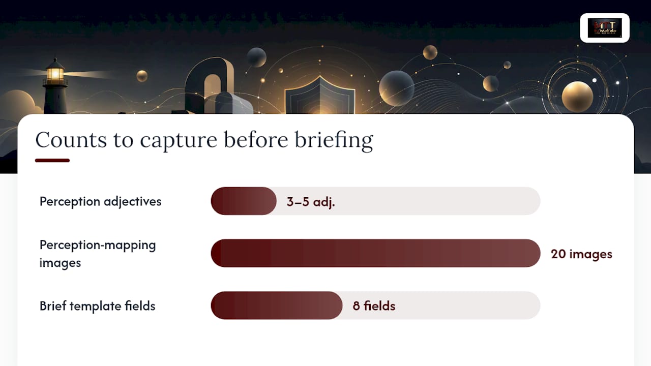
A short, disciplined brief prevents arbitrary design choices. The checklist below is what to capture before concepting begins.
- Business goal and the metric that defines success
- Primary and secondary audience segments with behavioral descriptors
- Competitive category map — who occupies which perceptual territory
- Desired perception definitions — three to five adjectives the brand must own
- Non-negotiables and an explicit “avoid this” list
- Measurable success criteria tied to the brief
- Accessibility and technical constraints (WCAG level, platform requirements)
- Existing asset inventory — what can be retained, what must be replaced
Workshop prompts for a perception-mapping session:
- “Sort these 20 images into ‘feels like us’ and ‘does not feel like us’ — then explain the boundary.”
- “If this brand were a hotel, which category would it be in, and why?”
- “Name one brand in a completely different category that has the emotional quality we want.”
- “What would make a customer feel we had broken our promise?”
- “Which of these two type samples feels more trustworthy to our buyer, and what makes the difference?”
- “Describe the brand in three words — then describe what it must never be.”
Brief template fields:
- Brand name / working title:
- Business goal:
- Primary audience:
- Desired perception (3–5 adjectives):
- Avoid-this list:
- Success metric:
- Constraints (tech, accessibility, budget):
- Asset inventory status:
D&AD Masterclass training uses structured workshop formats precisely because pre-concept alignment reduces the number of failed directions — a finding consistent with how professional brand teams approach kickoffs.
Pro Tip: Run the perception-mapping exercise with both the client team and a small sample of actual customers. The gap between how a brand team describes their brand and how customers experience it is almost always the most useful design brief you will ever write.
How do these principles apply to a luxury e-commerce experience?
In luxury e-commerce, designer branding signals craftsmanship and exclusivity through tactile cues, curated photography, and consistent packaging — not through price tags alone.
Four specific designer choices that map to measurable outcomes:
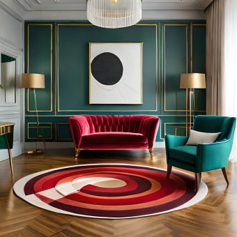
- Palette and material cues: Deep, saturated tones with gold or warm-metal accents signal premium positioning before a product name is read. This directly supports average order value by priming the buyer’s price expectation upward.
- Unboxing flow: Tissue paper weight, card stock, and ribbon color are brand touchpoints. Brands that invest here see measurable lifts in repeat purchase and social sharing.
- Product page hierarchy: Lead with a full-bleed lifestyle image, follow with a detail shot, then specifications. This sequence mirrors how luxury buyers evaluate quality — feel first, facts second.
- Photography direction: Consistent lighting temperature, surface textures, and negative space across all product images create a catalog that reads as a single curated collection rather than an aggregated inventory.
Three things you can implement this week:
- Audit your product page images for lighting consistency — replace any shot that breaks the visual temperature of the set.
- Add a single brand-color accent to your email template header and footer to create visual continuity between inbox and site.
- Write a one-page photography brief that specifies background color, lighting style, and prop rules for all future shoots.
Mytotaltake’s curated approach to luxury home decor demonstrates how consistent visual presentation across product categories builds the kind of trust that converts first-time browsers into repeat buyers.
Key Takeaways
Designer branding works because it converts positioning into a consistent visual system that builds trust in 50 milliseconds and can lift revenue by up to 33% when applied with discipline.
| Point | Details |
|---|---|
| First impressions are instant | Visual credibility forms in roughly 50ms — design quality is the first filter buyers apply. |
| Consistency drives revenue | Brands with consistent presentation across channels can see up to 33% revenue uplift. |
| Designers are strategists | The designer’s job is to translate business goals into repeatable visual rules, not just aesthetics. |
| Governance prevents drift | Assign a brand owner, tokenize values, and document rationale to keep identity consistent at scale. |
| Mytotaltake applies this | Mytotaltake’s curated collections demonstrate brand-aligned product presentation that builds lasting buyer trust. |
Why most brand projects fail before the first concept is shown
The conventional wisdom says brand projects fail because of bad design. They rarely do. They fail because the brief was vague, the stakeholders had different pictures in their heads, and no one documented what the brand was supposed to feel like before the designer opened a file.
The 50-millisecond research and the revenue-consistency data are not arguments for spending more on design. They are arguments for doing the pre-concept work properly. A perception-mapping workshop, a documented design code, and a named brand owner cost almost nothing compared to a rebrand triggered by inconsistent execution two years after launch.
The other underestimated challenge is stakeholder language. When a client says “make it feel premium,” that adjective means something different to every person in the room. The designer’s job is to make the abstract concrete — through image sorting, boundary-defining questions, and documented decisions — before a single visual direction is proposed. That discipline is what separates brand work that holds over time from work that gets revised into mediocrity.
Mytotaltake brings brand-aligned curation to every product category
The principles in this article — consistent visual language, curated presentation, and tactile quality signals — are exactly what separates a premium product experience from a generic one. Mytotaltake applies that thinking across every category it carries, from luxury furniture that earns its place to designer accessories selected for craftsmanship and lasting elegance.
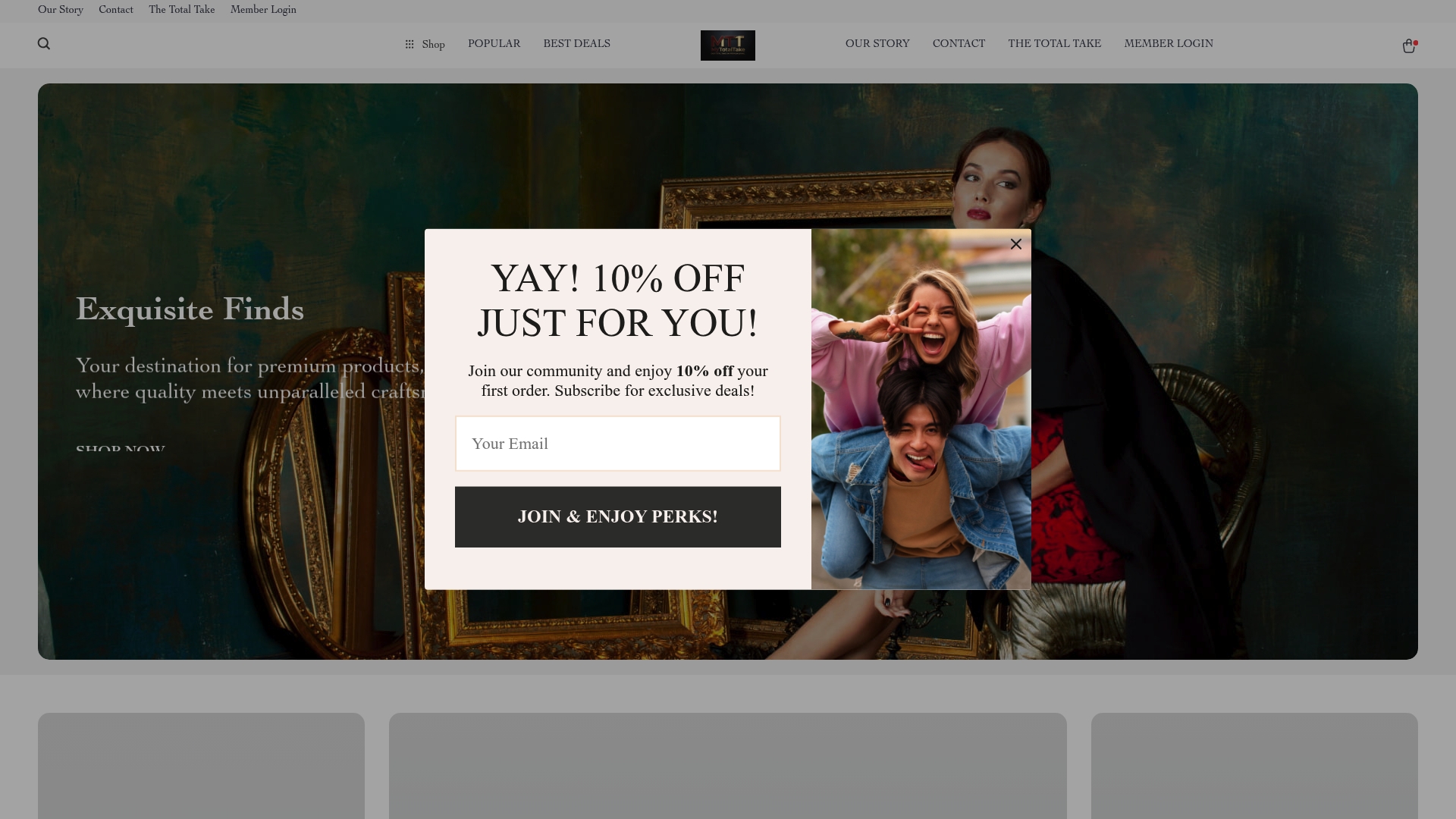
Every collection on Mytotaltake is chosen with the same discipline a brand designer brings to a visual system: nothing is there by accident, and every piece signals quality before the buyer reads a single specification. If you want to see what brand-aligned product curation looks like in practice, explore what makes a designer piece worth owning and find the pieces that reflect your own standard.
Useful sources and further reading
The sources below underpin the claims in this article. Each is worth reading in full for the depth it adds.
- From kickoff to first concept: How to turn brand strategy into visual direction — Smashing Magazine
- The role of design in branding | Fabrik Brands
- Brand identity design: The complete guide | Taqtics
- The best start-ups are built on brand — designers should have a stake | Design Week
- What is a brand designer? Role and responsibilities | LogRocket Blog
- Brand design and brand strategy for creatives — D&AD Masterclass
- What is brand design? Complete guide with step-by-step process for 2026 | Magier










Leave a comment