
How to Decorate with Designer Accessories: A Curated Guide
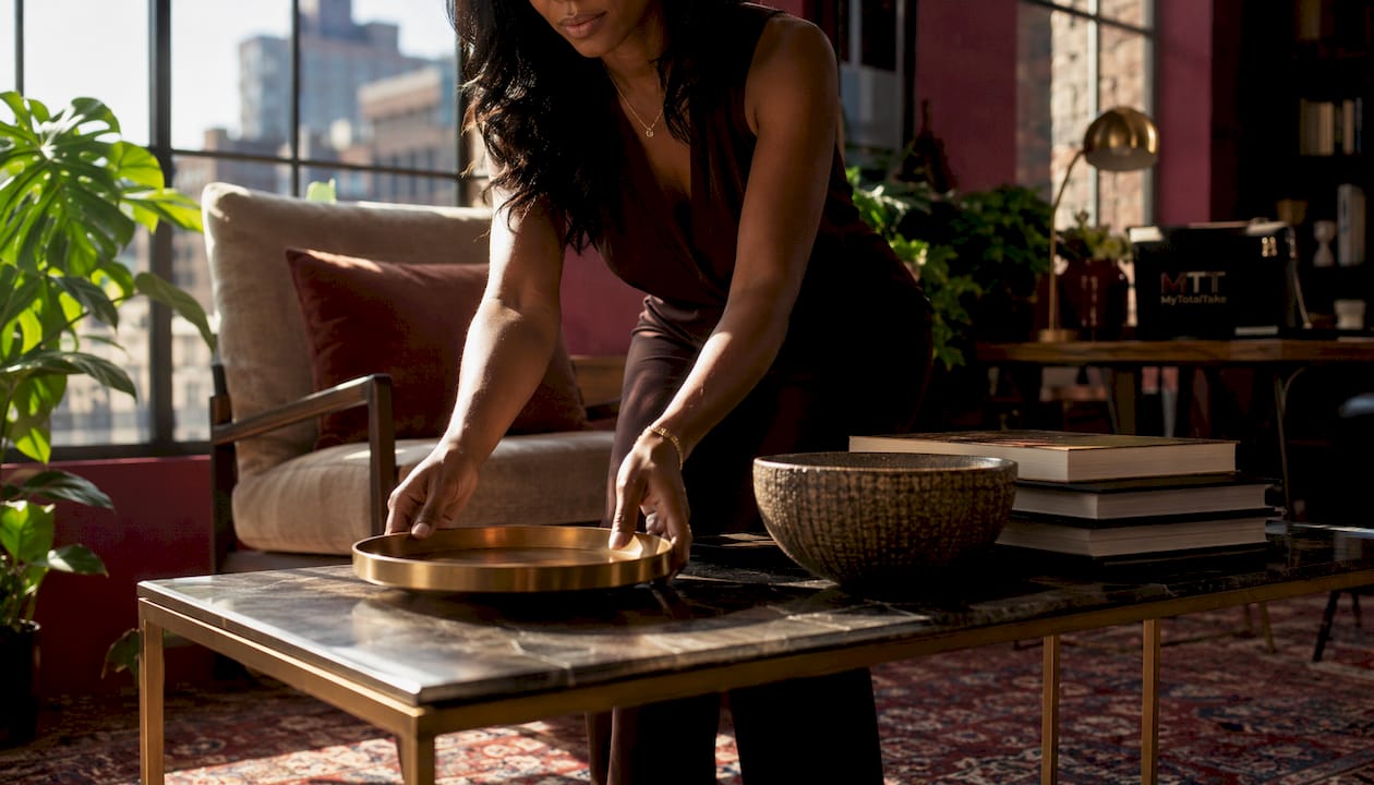
Start every styled surface with one anchor piece, leave a substantial portion of the surface empty, and group supporting objects in odd numbers. That single principle separates a room that reads as collected and intentional from one that simply looks full. Designers call this the rule of 30/70: the empty portion is not wasted space, it is what gives each object room to be seen.
Three moves you can make today:
- Swap one standard element for a premium finish. Cabinet hardware, a lamp base, or a tray in brushed brass or honed stone instantly shifts the perceived quality of an entire surface.
- Hang curtains close to the ceiling, not the window frame. This single change adds visual height to any room without touching a single accessory.
- Add one living element per room. A potted plant, a stem in a ceramic vase, or a bowl of seasonal botanicals grounds the space and keeps it from reading as a showroom.
Later sections walk through room-level recipes for your coffee table, entry console, and bedside surface, each built around the 3–5 piece formula that professional stylists return to again and again.
Table of Contents
- Why designer accessories change how a room reads
- Common mistakes that make designer pieces look cluttered
- How to layer accessories for real depth
- Getting proportion right: sizing accessories to your furniture
- How to mix materials and finishes for a layered look
- Symmetry vs. asymmetry: which approach fits each surface?
- Adding organic and personal elements that make a space feel lived-in
- How to display fashion accessories as decorative objects
- Styling formulas you can copy right now
- How to edit accessories over time and keep the look curated
- Mixing high and low: the upgrades that make designer pieces sing
- Room-by-room placement: where to put what
- Key Takeaways
- The case for editing over accumulating
- Mytotaltake’s curated collections make sourcing the hard part easy
Why designer accessories change how a room reads
Accessories are the jewelry of a room. Furniture sets the architecture; accessories tell the story. A sculptural vase adds artistry. A marble tray adds weight and a sense of permanence. A glass vessel catches afternoon light in a way no sofa ever could. Together, well-chosen objects shift a room’s perceived warmth, scale, and finish without touching a single wall.
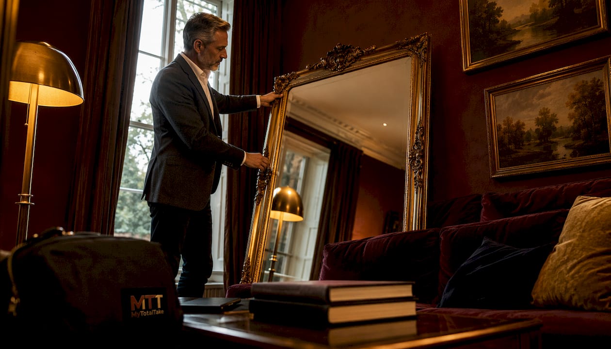
Mirrors are among the most effective tools in this regard: positioned to face a window or a chandelier, they effectively double perceived space and visual interest. That is not a decorating trick; it is how light and reflection actually work in a room.
Pro Tip: Choose accessories that echo the room’s existing palette and architectural lines. A ceramic object that picks up the warm undertone of your wood floors reads as integrated; one that fights the palette reads as an afterthought.
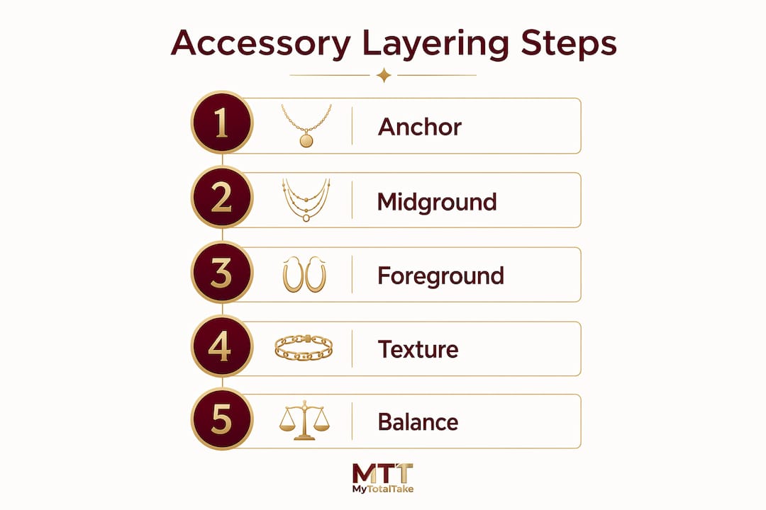
The best designer accessories for home spaces share one quality: they have presence without demanding attention. They reward a closer look without competing with the room’s foundation.
Common mistakes that make designer pieces look cluttered
Most styling errors come down to two habits: overfilling surfaces and buying too many small pieces before securing one strong anchor.
- No breathing room. When every inch of a surface is occupied, nothing stands out. The eye has nowhere to rest, and even expensive objects start to read as clutter.
- Matching sets. A perfectly coordinated set removes the contrast and variation that give a room its collected, over-time quality. Identical objects in a row signal “store display,” not “curated home.”
- Ignoring scale. A small object on a large sideboard disappears. A too-tall vase on a low coffee table blocks sightlines. Scale is the most common error and the easiest to fix.
- Mismatched materials without intention. Mixing materials is good; mixing them without a unifying thread creates visual noise. Every material should relate to at least one other element in the room.
Corrective checklist: Remove one item from any surface that feels crowded. Evaluate whether you have more than two of the same material or color in the grouping. Check that your tallest object is proportional to the furniture beneath it. Then reintroduce one living element, a plant, a stem, or a small bowl of organic texture, and reassess.
How to layer accessories for real depth
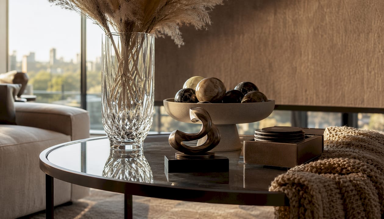
The layer model treats every surface as having three planes: background, midground, and foreground. Each plane does a different job, and filling all three is what creates the sense of depth that makes a vignette feel designed rather than assembled.
| Plane | Role | Object type |
|---|---|---|
| Background | Anchors the composition, adds height | Mirror, artwork, tall lamp, large vase |
| Midground | Builds visual interest, connects planes | Medium vase, sculptural object, stack of books |
| Foreground | Adds detail and ground-level texture | Small bowl, candle, low tray, organic element |
How to build it step by step: Place your anchor piece first, always at the back. A tall ceramic vase, a leaning mirror, or a lamp establishes the height ceiling for the whole composition. Next, add one or two medium-height objects slightly in front and to the side, never in a straight line. Finish with a low detail piece, a tray, a small sculptural object, or a candle, pulled slightly forward so it sits in the foreground plane. Leave negative space deliberately; a successful vignette mixes varying heights, at least three textures per surface, and always includes something living.
For a console table, the formula looks like this: tall vase or lamp at the back left, a medium decorative bowl or sculptural object center-right, and a small organic element or tray at the front. For a coffee table, use a tray as the foundation, stack two books inside it, add a low bowl, and place one taller element just outside the tray’s edge.
Pro Tip: Aim for at least three distinct textures per plane: one soft (textile, dried stem), one hard (stone, metal, lacquer), and one organic (wood, ceramic, plant). When all three are present, each layer reads as intentional rather than accidental.
For wall-level compositions behind consoles and shelves, decorating living room walls with art or framed pieces provides the background anchor that ties the entire vignette together.
Getting proportion right: sizing accessories to your furniture
Scale is the rule most homeowners skip, and it shows. A single tall vase that reaches roughly two-thirds the height of a console table looks intentional. That same vase on a large eight-foot sideboard reads as a forgotten object.
Measurement guidance for common surfaces:
- Coffee table: Keep the tallest element under 12 inches so sightlines across the room stay clear. A tray that covers roughly one-third of the table surface creates a natural boundary for the arrangement.
- Console table: One vertical element (lamp, tall vase, or mirror) should reach at least half the height of the wall above the console. Supporting pieces should step down in height from there.
- Bedside table: Limit to 3 pieces maximum. The lamp should be tall enough that the shade sits at eye level when you are seated in bed.
- Mantel: Use one large central anchor or a pair of objects at either end, never a row of equal-height pieces across the full length.
- Open shelving: Vary heights from shelf to shelf so the entire wall reads as rhythmic rather than uniform.
Before/after example: a tall, narrow ceramic vase placed on a low console creates lift and draws the eye upward, which is exactly what an entryway needs. Place that same vase on a wide, substantial sideboard and it shrinks. On the sideboard, choose a wider, lower bowl as the anchor and let the vase become a supporting midground piece.
Pro Tip: When in doubt, choose one large or medium anchor per surface rather than several small objects. A single piece with strong form and good material reads as more considered than five small pieces that compete for attention.
How to mix materials and finishes for a layered look
The goal is contrast with coherence. Contrast is what makes a composition interesting; coherence is what keeps it from feeling chaotic. The two work together when you follow a simple structure: one primary neutral material, one or two accent materials repeated across the room, and one accent metal used consistently.
- Contrast principles to follow: Pair matte with shiny (honed stone tray beside a lacquered bowl). Pair smooth with rough (glazed ceramic beside a woven textile). Pair warm metals with cool stone (brass beside marble).
- Pairing examples that work: A brass lamp beside a honed stone tray. A glazed ceramic vase on a woven linen runner. A glass vessel beside a raw wood object. Each pairing creates tactile variation without visual noise.
- Protecting coherence: Anchor with large pieces first, then mix warm woods, brushed metals, ceramics, and soft textiles around them. Limit your palette to one primary neutral plus one or two accent materials that repeat across the room.
- What to avoid: Three different metals in one room (brass, chrome, and matte black together rarely resolve). More than two dominant textures on a single surface. Shiny objects placed next to other shiny objects with nothing matte to ground them.
Pro Tip: Pick one accent metal and repeat it in two or three places across the room: a lamp base, a picture frame, and a small tray. That repetition creates the thread of cohesion that makes a room feel designed rather than decorated.
Symmetry vs. asymmetry: which approach fits each surface?
Neither is universally better. The choice depends on the surface, the room’s mood, and what you want the eye to do.
| Surface | Best approach | Why |
|---|---|---|
| Bedside tables (pair) | Symmetry | Creates calm, restful balance suited to sleep spaces |
| Formal entry console | Symmetry | Projects order and intention at the home’s threshold |
| Coffee table | Asymmetry | Adds movement and a collected, lived-in quality |
| Open shelving | Asymmetry | Prevents a rigid, retail-display feel |
| Dining table centerpiece | Either | A single oversized bowl reads as elegant; a pair of vases adds formality |
Simple rule: Use symmetry where you want calm and formality. Use asymmetry where you want energy and a curated, over-time look.
Do this: on a coffee table, place a tray slightly off-center, stack books at one end, and position a sculptural object at the opposite corner. The visual triangle this creates is more interesting than any centered arrangement.
Don’t do this: mirror-match every surface in a room. When everything is symmetrical, the space reads as staged rather than lived in. Reserve symmetry for the surfaces where it earns its formality.
Adding organic and personal elements that make a space feel lived-in
Plants, fresh flowers, and natural textures do something no manufactured object can: they signal that someone actually lives here. A potted fiddle-leaf fig, a stem of eucalyptus in a ceramic vase, or a bowl of smooth river stones adds warmth that even the most beautiful sculptural object cannot replicate on its own.
Personal items work the same way. Accessories should feel collected over time, reflecting travels, gifts, and heirlooms rather than a single shopping trip. A small ceramic piece brought back from a trip, a framed photograph in a quality frame, or an inherited object placed deliberately on a shelf tells a story that a trend-driven fill never will.
- Seasonal rotation keeps the look fresh. Swap one accent object, a small textile, and the botanical element each season. In summer, a bowl of shells or a light linen throw. In fall, dried stems in a warm-toned vase. In winter, a small sculptural object in a dark or matte finish.
- Avoid personal-item clutter by treating each personal piece as a sculptural element. It needs a clear sightline, a grounding object beside it (a tray, a book, a neutral bowl), and negative space around it.
- Pair living elements with hard objects. A plant beside a stone tray. A stem in a ceramic vase beside a metal object. The contrast between organic and refined is what makes both elements read more clearly.
How to display fashion accessories as decorative objects
Fashion pieces, when displayed with intention, function as sculptural art. The key is treating them as objects with form and material value, not as stored items left in view.
- Jewelry in framed shadowboxes. A well-lit shadowbox mounted on a dressing room or bedroom wall turns a collection of fine jewelry into a gallery installation. Use a dark velvet backing to make metals and stones read clearly.
- Scarves and hats on mounted hooks. A row of quality brass or matte black hooks on a bedroom or entry wall turns silk scarves and structured hats into a composition. Vary the heights of the hooks slightly so the arrangement reads as curated rather than utilitarian.
- Handbags on protected shelf niches. A structured shelf with a low lip, lined in suede or linen, keeps bags upright and visible while protecting their shape. Pair each bag with one small neutral object so it reads as part of a composition, not just stored.
- Statement jewelry on tabletop stands. A sculptural jewelry stand on a dressing table or bedroom shelf turns a single piece into a focal point. Choose a stand in a material that contrasts the jewelry: a matte ceramic stand for gold pieces, a brass stand for pearls or stones.
Safety considerations:
- Keep valuable items away from direct sunlight, which fades leather, silk, and stones over time.
- Pair open display with secure storage for pieces you wear regularly; display works best for items used occasionally or retired from rotation.
- Treat displayed fashion items as you would art: dust them, handle them with care, and rotate them seasonally.
For a dressing table setup, pair a jewelry stand with a small framed mirror, a low tray for daily-use pieces, and one organic element such as a small plant or a single stem. The combination reads as personal and considered.
Styling formulas you can copy right now
The styling formula that professional designers return to most often is deceptively simple: start with one statement piece, then build layers of material and texture around it, and repeat one or two accent colors across the room for cohesion.
Surface recipes:
- Coffee table: Tray as foundation + two stacked books + one low sculptural bowl + one taller element just outside the tray (a small vase or candle). Leave at least one-third of the table surface clear.
- Entry console: Tall mirror or artwork leaning against the wall + one vase at medium height + a small catchall tray or bowl at the front. Add one living element, a plant or stem.
- Bedside table: Lamp (tall) + one book or small object (medium) + one small plant or organic element (low). Three pieces maximum.
On the 3-5-7 rule: Odd numbers work because they prevent the eye from pairing objects and moving on. But the number matters less than the variation in height and material. A group of three objects that are all the same height and material reads as flat. A group of three that vary in height, texture, and form reads as collected. Prioritize variation over strict counting.
Photography tip: Style for both real life and for photos by checking the arrangement from the angle a camera would capture it, usually slightly above and to the side. Negative space reads more clearly in photos, so edit more aggressively than you think you need to.
Quick checklist for any surface:
- One anchor piece (large, with presence)
- One or two supporting pieces (varied height and material)
- One organic or living element
- At least 30% of the surface left empty
- No more than two of the same material in one grouping
How to edit accessories over time and keep the look curated
Styling is not a one-time event. Collections grow, tastes shift, and surfaces that looked right six months ago can start to feel crowded without a single new object being added. A repeatable edit workflow keeps the look intentional as your home evolves.
- Monthly quick edit: Walk each room and remove one object from any surface that feels busy. Live with the edited version for a week before deciding whether to return the piece or store it.
- Seasonal rotation: Swap the botanical element, one small textile, and one accent object each season. This keeps the room feeling current without requiring new purchases.
- Annual deep edit: Photograph every styled surface. Images reveal clutter that the eye normalizes in person. Remove any object that does not earn its place when you see it in a photo.
- Storage for rotated pieces: Keep rotated accessories in labeled, dust-free boxes or trays so they remain in good condition and are easy to reintroduce. An object stored carelessly is an object you will not want to use again.
Pro Tip: Photograph your styled surfaces before and after each edit. The camera is a more honest editor than your eye, and the before/after comparison makes it immediately clear which objects were earning their place and which were just filling space.
A practical home decor styling workflow treats editing as part of the process, not a sign that something went wrong. The best rooms are the ones that have been edited as many times as they have been styled.
Mixing high and low: the upgrades that make designer pieces sing
High-low mixing works best when one tactile, well-made anchor leads the composition and less expensive accents support it. A single designer or artisan piece, a hand-thrown ceramic lamp, a marble tray, a quality sculptural object, reads as high-end when surrounded by well-chosen, understated basics. The basics do not need to be expensive; they need to be proportional, well-made in their category, and materially coherent with the anchor.
| Upgrade | Effort | Impact |
|---|---|---|
| Replace cabinet hardware with brushed brass or matte black | Low | High: shifts perceived quality of entire surface |
| Hang curtains at ceiling height | Low | High: adds visual height to any room |
| Add a mirror facing a window or light source | Low | High: doubles perceived space and light |
| Incorporate one living element per room | Low | High: adds warmth no manufactured object replicates |
| Replace a standard lamp with a sculptural base | Medium | High: anchor piece that elevates surrounding objects |
Affordable accessories that consistently read as high-end include decorative books, ceramic vases, woven baskets, and sculptural candleholders. These are the supporting cast. The anchor, the piece you invest in, is what gives them context.
Pro Tip: Invest in one well-made anchor per room, a quality lamp, a sculptural mirror, or a hand-finished ceramic piece, and rotate lower-cost seasonal items around it. The anchor’s quality lifts everything near it.
For guidance on what makes a piece worth investing in, look for hand-finishing, material integrity, and a form that will not date in three years.
Room-by-room placement: where to put what
Living room
The coffee table is the room’s styling centerpiece. Use the tray-based formula: one low bowl, two stacked books, one sculptural object, and a small vase or candle just outside the tray. For the console or sideboard, follow the background-midground-foreground layer model. Styling a luxury living room well means treating the sofa’s throw pillows and the side table lamp as part of the same composition, not separate decisions.
Bedroom
The bedside table calls for restraint: lamp, one book or small object, one organic element. Nothing more. The dresser or chest of drawers can carry a slightly larger vignette, a tray with a small jewelry stand, a framed photo, and a low plant, but the 30% empty-space rule applies here more strictly than anywhere else. The bedroom should feel calm, and clutter on surfaces is the fastest way to undermine that.
Kitchen
Open shelving in a kitchen is where material mixing earns its keep. Alternate cookbooks with ceramic objects, a small plant, and a bowl of seasonal fruit or vegetables. Vary heights across shelves. On the counter, limit decorative objects to one or two: a quality oil bottle, a ceramic utensil holder, or a small potted herb. Functional objects styled well read as intentional; purely decorative objects in a kitchen can feel out of place.
Bathroom
The bathroom rewards restraint and quality materials. A small tray on the vanity holding two or three items, a quality soap dispenser, a small plant, and one sculptural object, reads as spa-like. A mirror with a quality frame is the single highest-impact upgrade in a bathroom. Add one candle or a small vase with a stem, and the room is styled.
Key Takeaways
Styling with designer accessories comes down to one discipline: edit more than you add, and let each object earn its place.
| Point | Details |
|---|---|
| One anchor per surface | Start with a single large or medium piece; build supporting objects around it in odd-numbered groups. |
| Keep 30% empty | Leave at least 30% of every surface clear so styled objects read as curated, not crowded. |
| Mix materials with a thread | Pair contrasting textures and finishes, but repeat one accent metal in two or three places to unify the room. |
| High-low mixing works | One well-made anchor piece elevates affordable supporting accessories; invest there first. |
| Mytotaltake for sourcing | Mytotaltake’s curated collections help homeowners identify anchor pieces and supporting accessories that hold their quality over time. |
The case for editing over accumulating
The conventional advice on decorating with designer accessories tends to focus on what to buy. More pieces, more variety, more layers. What that advice consistently underweights is the discipline of removal.
The rooms that read as genuinely luxurious, the ones that feel personal and considered rather than staged, are almost always the ones that have been edited more aggressively than they have been styled. A single well-chosen ceramic object on an otherwise clear shelf communicates more about taste and confidence than a shelf filled with ten carefully selected pieces. Restraint is not minimalism; it is the willingness to let each object be seen.
The collected look that designers describe, accessories that feel like they arrived over years rather than in one afternoon, is achievable for any homeowner. It requires patience more than budget. Buy one anchor piece that genuinely moves you, place it well, and resist filling the space around it until you find something that earns its place beside it. That is the approach Mytotaltake is built around: not more, but better, and chosen with enough intention that the room still feels right five years from now.
Mytotaltake’s curated collections make sourcing the hard part easy
Finding anchor pieces that hold their quality, their form, and their relevance over time is where most homeowners spend the most effort and make the most expensive mistakes. Mytotaltake takes a different approach: every piece in its collections is selected for craftsmanship, material integrity, and lasting design, so you are not choosing between hundreds of options that look similar but perform differently.

Whether you are sourcing a sculptural lamp for a living room console, a quality tray for a bedside surface, or an anchor piece for an entryway, Mytotaltake’s luxury furniture and accessories collections give you a curated starting point rather than an open search. The site also offers practical guidance on what makes a designer piece worth its price, so you can apply the high-low mixing rules from this article with confidence. Browse the collections and identify your next anchor piece today.
Useful sources
The styling rules, research-backed upgrades, and pro tips in this article draw from the following published sources. These are the primary references used for vignette formulas, material guidance, and high-low mixing strategy.
- Styling and Accessories: How to Decorate Like a Designer — source for the rule of 30/70 and vignette height/texture formulas
- Cheap ways to make your home look expensive, interior designer advice — source for mirror, curtain height, and hardware upgrade recommendations
- The styling formula that makes any room look high-end with luxury decor on a budget — source for the statement-piece-first method and affordable high-impact accessories
- Luxury Home Decor Accessories Guide by Kern & Co. — source for anchor-first sequencing, material mixing, and the accessories-as-jewelry framing
- 5 Designer-Approved Tips for Choosing Home Accessories That Always Work — source for the collected-over-time principle and personal/heirloom object guidance
- How to style luxury designer pieces: 3 foolproof strategies — source for high-low mixing strategy and seasonal refresh guidance
- How to Style Decorative Bowls, Vases, and Objects — source for surface-level styling formulas and the designer styling formula (tall, low, sculptural, textural)
- Top 13 Luxury Home Decor Ideas for a High-End Interior — source for mirror placement, curtain height, hardware upgrades, and material layering








Leave a comment