
Coffee Table Styling: Designer Recipes You Can Copy
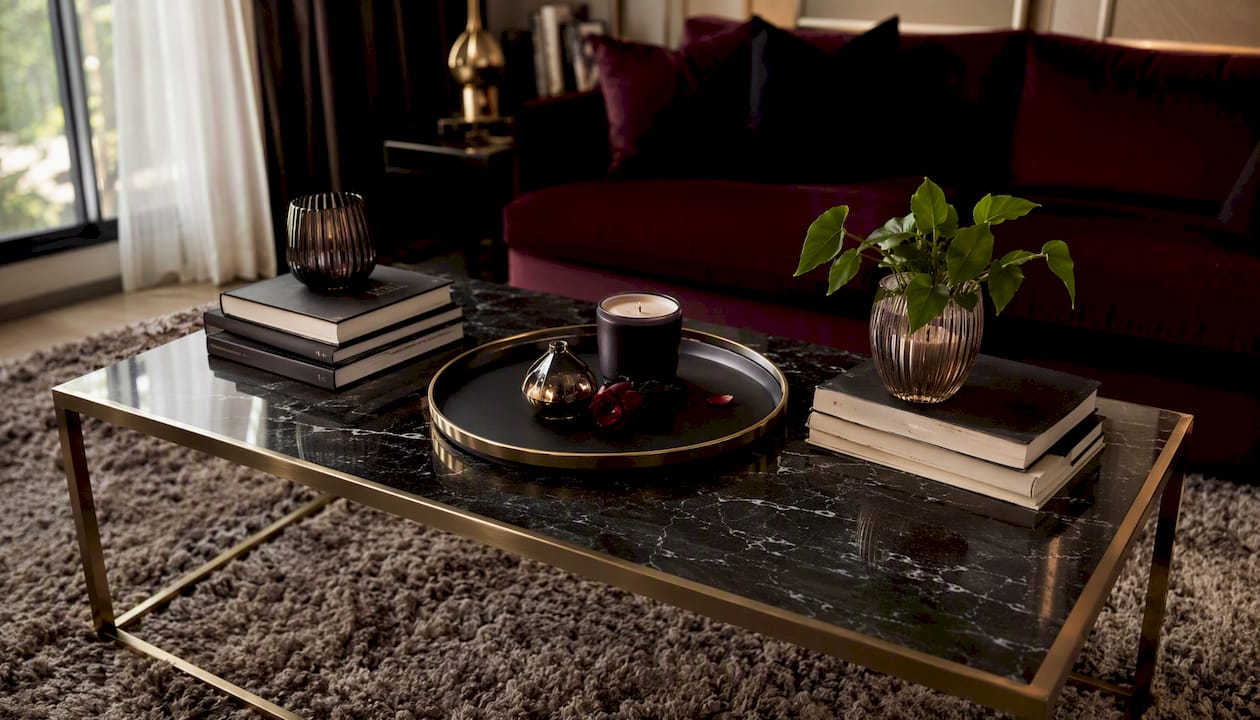
Anchor, layer, add life, edit. That is the entire formula, and it works on nearly every coffee table, in nearly every style of home. Start with one anchor piece, a tray or a stack of books. Build height around it in odd numbers, typically three objects. Add one living element, a small plant or a few stems. Then step back and remove whatever feels unnecessary.
Designer Valerie Darden builds her arrangements on the rule of thirds and a triangle of varying heights, which keeps a tabletop from reading flat or cluttered. That triangle, one tall item, one medium, one low, is the single most reliable trick in coffee table styling. Odd numbers of objects photograph better and feel more natural to the eye than even pairings, which tend to look rigid or accidental.
Before you commit to a final layout, take a photo with your phone. A camera flattens depth the same way a guest’s first glance does, so it exposes gaps and awkward clusters that are easy to miss standing over the table. This visual check is a habit borrowed directly from professional stylists, and it takes ten seconds.
Key Takeaways
The most reliable coffee table styling formula pairs one anchor object with a triangle of varying heights, one living element, and a final editing pass.
| Point | Details |
|---|---|
| Start with one anchor | Choose a tray or book stack first, then build the rest of the arrangement around it. |
| Follow the height triangle | Use odd-numbered groupings of tall, medium, and low objects for natural visual balance. |
| Adapt to shape and material | Round tables want a centered vignette; glass needs contrast; ottomans need a stabilizing tray. |
| Keep it family-friendly | Lidded boxes, heavy ceramics, and a five-minute reset routine protect the look under daily use. |
| Verify with your phone camera | Photograph the finished layout to catch imbalances before calling the arrangement done. |
| Source pieces with real weight | Mytotaltake’s curated trays, vases, and objects give the material contrast designer recipes require. |
Table of Contents
- What Is the Best Coffee Table Styling Formula?
- How Do You Style a Coffee Table Step by Step?
- Which Designer Recipes Actually Work Every Time?
- How Do You Style a Coffee Table by Shape and Size?
- Does the Table Material Change How You Should Style It?
- What Objects Belong on a Coffee Table?
- How Do You Style a Coffee Table With Kids or Pets?
- What Are the Most Common Coffee Table Styling Mistakes?
- Coffee Table Styling: Simple Designer Recipes You Can Copy
- Shop Curated Pieces to Complete Your Coffee Table
- Frequently Asked Questions
- Sources
What Is the Best Coffee Table Styling Formula?
The most dependable version, echoed across nearly every design authority, comes down to four elements: one tray or book stack as an anchor, a mix of heights, one organic touch, and one or two personal objects. House Beautiful describes this as a loose baseline formula: a tray, a stack of art or design books, an organic element like a branch or bowl of citrus, and one or two decor pieces that feel personal rather than staged.

This baseline works because it solves two problems at once. It gives the table a visual center of gravity, and it keeps the surface usable for coffee mugs, remotes, and actual life. Studio McGee’s approach leans on the same logic, starting with a stack of books or a tray as the organizing element before layering in shape and height variation.
Skip the formula entirely and you get one of two failure modes: a bare table that feels unfinished, or a cluttered one that looks like a garage sale. The formula exists to prevent both.
How Do You Style a Coffee Table Step by Step?
Treat this as a five-step process, not a single decorating decision. Each step builds on the last, and skipping one usually shows up as an awkward gap or a pile that feels unintentional.
- Clear the table completely. Start from nothing. Check that there is roughly 18 inches of clearance between the table edge and the sofa for comfortable knees and foot traffic, since a table that is too close will make even a perfect arrangement feel cramped.
- Choose your anchor. A rectangular table usually wants a tray at one end and a book stack at the other. A round or square table often does better with a single centered anchor, either a tray or a stack, not both competing for attention.
- Build a high, medium, low triangle. Place your tallest item, a vase or a slim sculpture, then a medium piece like a stacked candle or small box, then something low like a dish or a single stem in a bud vase. This triangle is what Darden and other designers return to again and again.
- Add a living element and something personal. A small plant, a few eucalyptus stems, or a bowl of lemons brings life to the surface. Pair it with one object that has meaning, a travel find, a piece of art glass, something that keeps the table from feeling like a showroom display.
- Edit ruthlessly, then verify with your phone. Remove one item. Almost always, the arrangement improves. Photograph the final layout and check that the composition reads clearly from the main seating angle, not just from directly above.
Pro Tip: Take the photo from where you actually sit, not from standing above the table. Most coffee table arrangements are judged from a low seated angle, and what looks balanced from above can look lopsided from the couch.
Colin King, the stylist frequently credited with popularizing this exact sequence, starts from a blank slate and builds up with books, sculptural pieces, and a final natural element, always leaving room to breathe. Negative space is not an afterthought in his approach. It is the thing that makes the other objects look considered instead of crowded.

Which Designer Recipes Actually Work Every Time?
Once you understand the workflow, you can shortcut it with a handful of repeatable recipes. Each one is built for a slightly different table, lifestyle, or occasion, and each takes under ten minutes to assemble.
- Tray, two books, a vase, one small object. The most universal formula. Works on almost any table shape and holds up to daily use because the tray corrals everything into one movable zone.
- Book stack, candle, natural element. A quieter, more minimal recipe. Best on smaller tables or in rooms where you already have a lot of visual texture elsewhere.
- Single sculptural object with generous negative space. For a large rectangular table, one striking piece, a ceramic form, a substantial bowl, a piece of art glass, can carry the whole surface if you resist the urge to add more.
- Two low bowls plus a short book stack. A softer, more casual look that suits family rooms where the table sees constant traffic.
- Layered trays at different heights. Works well on a large square or rectangular table where you want two distinct zones without visual competition.
- A game or puzzle box styled as the centerpiece. For a family-focused living room, a beautifully designed box or board game can double as both decor and function, especially on an ottoman.
An ottoman coffee table with a soft, slightly uneven surface is the clearest case where recipe one wins by default: the tray gives you a stable, flat plane for everything else to sit on, which a cushioned top cannot provide on its own.
How Do You Style a Coffee Table by Shape and Size?
Shape changes everything about how a formula should be applied, and this is where most people go wrong copying a photo without adjusting for their own table.
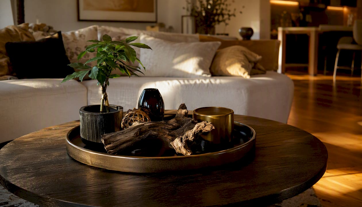
Round tables reward a centralized, rotate-friendly display. Because every side is visible, a single vignette in the middle, framed by a circular tray, reads as balanced from any seat in the room. Avoid pushing everything to one side, since a round table has no natural “back” to hide an asymmetric pile.
Rectangular and oval tables benefit from a grid or two-zone system, with a tray at one end and a book stack at the other to balance the length. Trying to center one small arrangement on a long table almost always looks lost in the extra space.
Square tables do best with either a symmetrical vignette, mirrored objects on either side of a center point, or one bold centerpiece and nothing else. Small, scattered clutter is the fastest way to make a square table look busy rather than styled.
Ottoman and upholstered tables need a large, stable tray before anything else goes on top. Low-profile accessories work better here than tall vases, which can tip on a softer surface.
Grouped or two-table setups hold together visually when you stagger heights between the tables and repeat one small motif, the same candle shape, the same material, on both. TLC Interiors notes that coffee tables should echo colors and shapes found elsewhere in the room rather than existing as an island of their own. Pull one color from your rug or one texture from your sofa into the tabletop styling, and the whole room reads as intentional rather than assembled piece by piece. For more on tying a table back into the full room, see how luxury living room composition extends the same logic outward.
Does the Table Material Change How You Should Style It?
Material dictates weight, contrast, and how forgiving the surface will be day to day, so it deserves its own set of rules.
Glass tables need visual grounding. A clear top with clear or light objects on it disappears into itself, so choose pieces with real color, texture, or opacity, a matte ceramic vase, a dark leather book cover, to give the eye something to land on.
Wood tables already carry warmth, so restraint matters more here than on any other material. One or two contrasting accents, a brushed metal tray or a piece of raw stone, keep a wood surface from feeling monotone without overwhelming its natural grain.
Stone and marble tables look best minimal. The veining is the star, so let it show through gaps between objects rather than covering it. Use non-porous coasters under anything with moisture and small felt pads under decorative objects, since marble stains and scratches more easily than most people expect.
Upholstered and ottoman surfaces need a tray as a non-negotiable first move, both for stability and to protect fabric from spills, wax drips, and scuffing.
Pro Tip: Keep a set of discreet felt coasters in a drawer near the sofa. They protect stone and wood alike without adding visual clutter to the arrangement itself, and you can slip them under a sweating glass in seconds.
What Objects Belong on a Coffee Table?
A well-stocked but restrained inventory makes every future refresh faster, because you are rearranging familiar pieces rather than starting from zero each season.
- Trays. The anchor for most formulas. Choose one large enough to hold three to four smaller objects without crowding.
- Coffee table books. Stack two to three, largest on the bottom, and use the top of the stack as a small display shelf for a candle or object.
- Low vases. Best at 6 to 10 inches tall so they do not block sightlines across the room.
- Candles. Place on a tray or a small dish, never directly on wood or upholstery.
- Decorative bowls and boxes. Ideal for corralling remotes, coasters, or small clutter while still looking intentional.
- Sculptural objects. One per table is usually enough; more than that competes for attention.
- Games or puzzles. A strong choice for family rooms, doubling as both decor and entertainment.
For seasonal refreshes, swap one element rather than the whole layout, following advice from how to style a drinks table for any gathering on seasonal tabletop arrangements. A single seasonal candle, a small gourd in autumn, a sprig of eucalyptus in winter, updates the mood without disturbing the base formula you already know works. The workflow for seasonal decor swaps follows the same clear, layer, edit rhythm as everyday styling, just applied on a smaller scale.
How Do You Style a Coffee Table With Kids or Pets?
Aesthetics and daily life do not have to compete, but they do require different object choices than a showroom table would use.
- Lead with a tray or lidded box. Anything without a container is at risk of being knocked off during normal foot traffic, so give loose objects a home.
- Choose heavy, unbreakable materials. Solid ceramic or thick glass resists tipping better than lightweight decor, and it survives an accidental bump.
- Keep candles out of reach or skip them near young children. A tray at the center of the table, away from the edges, is safer than a candle sitting near where small hands land first.
- Store remotes and cords in a lidded box. This single move does more for a “styled” look than almost any decorative object, because visual clutter is often just misplaced function.
- Build in a five-minute reset routine. Wipe the tray, straighten the books, rotate one object. A table that gets tidied daily stays photo-ready without a full restyle.
- Check for choking hazards at toddler height. Small stones, loose beads, or tiny decorative objects belong on a higher shelf until kids are older.
What Are the Most Common Coffee Table Styling Mistakes?
Most styling problems trace back to one of four habits, and each has a fix that takes less than five minutes.
- Overcrowding. Too many small objects compete for attention. Fix it by picking one focal area and removing everything that does not support it.
- Ignoring scale. A large rectangular table with tiny trinkets looks sparse and disconnected, even with several objects on it. Choose fewer, larger pieces instead of adding more small ones.
- Treating the table as isolated. A tabletop styled without any reference to the room around it always feels slightly off. Echo one color or texture from your rug, sofa, or curtains.
- Poor material contrast. Clear glass objects on a clear glass table disappear into each other. Swap in one object with real color or opacity to anchor the eye.
Architectural Digest’s guidance on mixing materials and leaving room for function covers both the overcrowding and contrast mistakes in one principle: fewer large items, more texture variety, and always a tray or box to contain daily-use items rather than letting them scatter across the surface.
Coffee Table Styling: Simple Designer Recipes You Can Copy
The conventional advice on coffee table styling treats it like a one-time decorating project, something you do once and photograph. That framing misses how these tables actually get used. A coffee table earns wear every single day, holding drinks, remotes, and stacks of mail, which means the styling has to survive contact with real life, not just a listing photo.
What most guides underestimate is how much shape and material should dictate the formula, rather than the formula dictating the table. A recipe that looks stunning on a large rectangular oak table can look sparse or awkward on a small round glass one. The rule of thirds, the height triangle, odd-numbered groupings, these hold steady across every table. What changes is how much space you give them and how much visual weight each object needs to carry.
The other overlooked point is maintenance. A styled table that never gets touched again slowly drifts into clutter, one extra mail pile at a time. The stylists who get quoted most often, Colin King among them, treat editing as an ongoing habit, not a final step. Rotate one object every few weeks. Photograph the table occasionally, the way you did when you first built the arrangement, and you will catch drift before it becomes a mess.
If there is one thing worth prioritizing above the rest, it is restraint. Most tables improve the moment you remove one object, not add one.
Shop Curated Pieces to Complete Your Coffee Table
Once you know the formula, the harder part is finding objects with enough weight, material quality, and craftsmanship to carry it. Mytotaltake curates trays, artisan vases, sculptural objects, and decorative boxes specifically chosen for the kind of visual weight and material contrast that designer-style arrangements depend on, rather than mass-produced pieces that look flat under real light.

Every order ships fast and includes free returns, which matters most when you are testing how a new tray or vase actually reads on your own table rather than in a listing photo. If a piece does not create that height and contrast you are after, sending it back costs you nothing. Browse the guide on decorating with designer accessories to see specific pairings, or shop the current tray, vase, and object collections and build your own triangle formula tonight.
Frequently Asked Questions
What is the easiest coffee table styling formula for beginners?
Start with a tray, add a short book stack beside it, place one small plant or stem, then remove one item before calling it finished. That single edit almost always improves the result.
How many objects should be on a coffee table?
Most designers favor odd numbers, typically three to five objects total including any tray or book stack, since odd groupings read as more natural than symmetrical pairs.
How do I style a small coffee table in an apartment?
Choose one anchor, either a small tray or a slim book stack, and skip the second zone entirely. A small table styled with three objects and generous negative space looks more intentional than one packed with five tiny pieces.
How often should I restyle my coffee table?
Rotate one or two objects every few weeks and do a full reset seasonally. Daily use naturally shifts things out of place, so a quick five-minute tidy keeps the arrangement looking considered without a full redo.
Sources
- How to Style Coffee Table Decor, According to Master Interior Stylist Colin King — Vogue
- How to Style a Coffee Table Like a Designer: 17 Genius Ideas — The Spruce
- You’re Styling Your Coffee Table All Wrong—Here’s How to Get It Right — House Beautiful
- Best coffee table ideas — Architectural Digest
Recommended
A Practical Guide to Selecting Bathroom Faucets
Comments
[…] a chaise projects too far into a walkway or whether a corner module leaves enough room for an end table. It also helps you picture how the sectional will relate to a rug, fireplace, media console, or […]









Leave a comment