Tips for Upscale Home Styling That Transform Any Space
Upscale home styling is the practice of curating a living space with intentional design choices that project sophistication, balance, and lasting elegance without requiring unlimited spending. Designers like Linda Hayslett, Molly Torres Portnof, and Tara Felice Engelberg consistently prove that luxe styling is curation over expenditure. The most impactful tips for upscale home styling focus on three core levers: strategic subtraction, intentional layering, and investment in a few statement pieces that anchor the entire room. Get these right, and every space reads as polished and considered.
1. Apply the rule of three to every styled surface
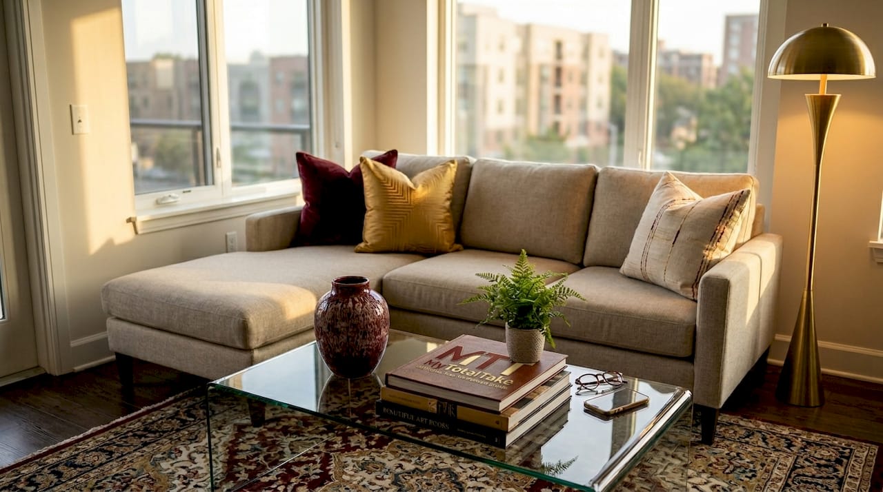
The rule of three is the single most reliable principle in elegant interior design. Odd-numbered groupings create natural visual movement because the eye cannot settle on a single pair, so it travels across the arrangement and perceives depth. That sense of movement is what separates a styled surface from a cluttered one.
The principle extends well beyond a coffee table vignette. Apply it to furniture layouts by anchoring a sofa with two accent chairs rather than a matching loveseat. Use it in lighting by combining an overhead fixture, a floor lamp, and a table lamp in one room zone. Build a color palette from three tones: one dominant, one secondary, one accent. Each application creates the same effect: visual balance and flow that reads as intentional rather than accidental.
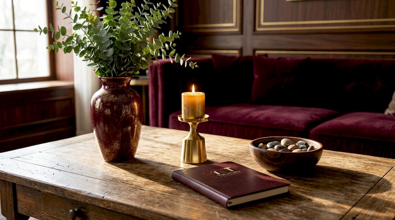
When grouping objects, vary height, scale, and texture within the trio. A tall ceramic vase, a mid-height candle holder, and a low decorative object create far more interest than three items of identical height. Avoid stiff symmetry by letting one piece lean slightly or overlap another.
Pro Tip: Anchor vignettes with trays or bases to visually unify grouped décor. A tray beneath three objects signals that they belong together, which is exactly what separates professional styling from amateur arranging.
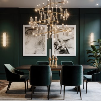
2. Use lighting to set the tone of every room
Statement lighting is the fastest way to shift a room from functional to refined. A chandelier, a pair of wall sconces, or a sculptural pendant does two things simultaneously: it acts as a focal point and it controls the emotional temperature of the space. Neither a bare bulb nor a generic flush mount can do that.
Bulb temperature matters as much as fixture choice. Warm lighting between 2600K and 3200K creates the cozy, amber-toned atmosphere associated with high-end hotels and well-appointed living rooms. Cooler task lighting in the 4000K to 5000K range belongs in workspaces and kitchens where clarity matters more than mood. Mixing both in a single room is not a contradiction. It is good design.
Layering is the key concept here. A room with only overhead lighting looks flat and institutional. Combine ambient lighting from a central fixture, task lighting from directional lamps, and accent lighting from picture lights or under-shelf strips. This layered lighting approach adds depth that no single fixture can achieve alone. For a deeper look at how lighting geometry shapes a room’s feel, the principles covered in kitchen illumination design apply across every room in the home.
Pro Tip: Dim your overhead lights and rely on lamps during evening hours. This single habit transforms the perceived quality of any room without changing a single piece of furniture.
3. Install window treatments high and wide
Custom window treatments achieve their luxurious effect more through installation geometry than fabric cost. Tara Felice Engelberg confirms that hanging drapery close to the ceiling and extending the rod well beyond the window frame on both sides creates the illusion of taller ceilings and grander windows. A moderately priced linen panel installed correctly outperforms an expensive fabric hung at the wrong height every time.
The practical rule is to mount the rod four to six inches above the window trim and extend it six to twelve inches beyond the frame on each side. When the curtain is open, it stacks off the glass entirely, letting in maximum light and making the window look architectural rather than decorative. For bedroom applications, the boutique hotel styling approach of floor-to-ceiling drapery creates a restful, enveloping atmosphere that no short curtain can replicate.
Choose fabrics with enough weight to hang straight. Linen, velvet, and heavyweight cotton all work. Sheer panels layered behind a heavier drape add dimension and allow light control without sacrificing elegance.
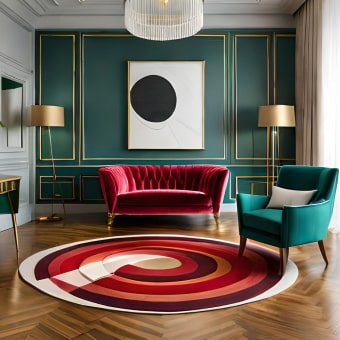
4. Layer textures and patterns with intention
Texture is the ingredient that makes a room feel inhabited rather than staged. Nina Grauer identifies the intentional mix of textures and patterns as one of the easiest upgrades available to homeowners. The word “intentional” carries all the weight here. Random layering creates visual noise. Deliberate layering creates richness.
The most effective combinations pair hard and soft materials: a leather sofa against a wool throw, a marble side table beside a linen armchair, a ceramic lamp on a raw wood console. Mixing vintage and new pieces adds the character that makes a room feel curated over time rather than purchased in a single afternoon. A well-worn brass candlestick beside a contemporary glass bowl tells a more interesting story than two matching objects from the same collection. You can explore this principle further through Mytotaltake’s perspective on craftsmanship and luxury living.
Pro Tip: Limit your color palette to three tones when layering multiple textures. A consistent palette holds the composition together and prevents the richness of varied materials from tipping into chaos.
5. Edit before you add anything new
The most counterintuitive tip in high-end home styling is this: removing items creates more luxury than adding them. Apartment Therapy frames this as a ten-minute styling hack with immediate impact. When you remove one or two objects from a surface, the remaining pieces gain breathing room and visual weight. They look chosen rather than accumulated.
Here is a practical sequence for editing any room:
- Take a photo of the space on your phone. The camera flattens the room and reveals clutter your eye has learned to ignore.
- Remove everything from one surface and replace only what you genuinely want there.
- Pull furniture two to three inches away from the walls. Rooms where every piece touches a wall feel smaller and more crowded, not larger.
- Add one tall plant in a quality pot to introduce height and organic movement. Designers Linda Hayslett and Molly Torres Portnof both cite statement greenery as one of the most cost-effective upscale upgrades available.
- Angle one piece of furniture slightly off the grid. A chair set at a diagonal to the room’s axis creates dynamic energy without requiring any new purchases.
Pro Tip: Use the photo test before and after every styling session. If the after photo does not look noticeably cleaner and more considered, remove one more item.
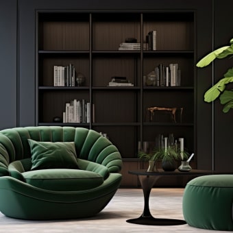
6. Choose furniture at the right scale and build clear focal points
Karen Wolf explains that furniture scaled correctly to its room maintains balance and harmony. Oversized pieces make a room feel cramped. Undersized pieces make it feel disconnected and sparse. Neither reads as upscale. The goal is furniture that fills its zone without dominating it.
Every room needs one clear focal point. In a living room, that might be a piece of well-arranged wall art, a statement fireplace surround, or a sculptural light fixture. In a bedroom, it is almost always the headboard wall. Once you identify the focal point, every other element in the room should support it rather than compete with it. Avoid placing two strong visual anchors on opposite walls. The eye cannot rest when it is pulled in two directions simultaneously.
Hardware cohesion is a detail that separates polished rooms from merely furnished ones. Antonio Matres recommends threading a single hardware tone, such as copper or rose gold, through multiple elements: cabinet pulls, lamp bases, picture frames, and decorative objects. This repetition creates a through-line that makes the room feel designed rather than assembled.
| Design element | What to prioritize |
|---|---|
| Furniture scale | Match piece size to room zone, not room size overall |
| Focal point | One strong anchor per room, supported by surrounding elements |
| Hardware tone | Repeat one metal finish across at least three objects |
| Negative space | Leave surfaces partially empty to let key pieces register |
| Art placement | Frame and hang at eye level, never above door height |
Key takeaways
Upscale home styling succeeds when you prioritize curation, scale, and lighting over volume of purchases.
| Point | Details |
|---|---|
| Edit before adding | Remove one or two items from any surface to let remaining pieces read as intentional. |
| Layer lighting | Combine ambient, task, and accent sources using warm bulbs at 2600K to 3200K for atmosphere. |
| Apply the rule of three | Group objects in odd numbers with varied height, scale, and texture for natural visual flow. |
| Install treatments correctly | Hang drapery near the ceiling and wide beyond the frame regardless of fabric cost. |
| Anchor with hardware | Repeat one metal tone across lamps, frames, and pulls to create a cohesive, designed feel. |
Why curation beats spending every time
I have spent years watching homeowners make the same mistake: they buy more before they edit what they already have. The result is a room full of individually attractive objects that collectively read as cluttered and unresolved. The most sophisticated interiors I have encountered share one quality. They feel considered. Every object appears to have been placed with a reason.
The tips that move the needle fastest are not the expensive ones. Adjusting lighting temperature costs almost nothing. Pulling furniture off the walls takes ten minutes. Installing curtain rods higher than the window trim requires a drill and an afternoon. These changes alter the perceived quality of a space more reliably than a new sofa ever will.
My honest recommendation is to start with lighting and editing, then invest in one statement piece per room once the foundation is right. A well-chosen home decor piece placed in a thoughtfully edited room will always outperform the same piece dropped into a crowded one. Negative space is not emptiness. It is the frame that makes everything else visible.
The readers who get the most from these principles are the ones who resist the urge to fill every surface and instead ask what the room needs rather than what they want to add to it. That shift in thinking is what separates a styled home from a decorated one.
— Lysander
Discover timeless pieces worth every inch of space
Knowing the principles is one thing. Finding furniture and décor that actually lives up to them is another. Mytotaltake curates luxury furniture selected specifically for homeowners who want pieces that earn their place rather than simply fill it. Every item in the collection is chosen for scale, craftsmanship, and the kind of timeless design that holds its visual weight for years.
Whether you are building a focal point around a statement chair or threading a hardware tone through an entire room, Mytotaltake’s premium decor guidance gives you the context to shop with intention. Browse the collection and find the pieces that complete your vision rather than crowd it.
FAQ
What is the fastest way to make a home look more upscale?
Remove one or two items from your most cluttered surface and pull all furniture slightly away from the walls. This single edit creates breathing room that immediately reads as intentional and refined.
Does upscale home styling require a large budget?
No. Designers consistently identify lighting adjustments, window treatment installation, and strategic editing as high-impact changes that cost very little. Investment in one or two quality statement pieces per room delivers more value than filling a space with many mid-range items.
How does the rule of three work in home styling?
Group objects in sets of three with varied height, scale, and texture. Odd-numbered groupings create natural visual movement that feels balanced and intentional rather than symmetrical and stiff.
What lighting temperature works best for upscale interiors?
Warm bulbs between 2600K and 3200K create the cozy, hotel-quality atmosphere associated with high-end interiors. Layer them with cooler task lighting in functional zones for both mood and practicality.
How do you create a focal point in a living room?
Choose one strong visual anchor, such as a large framed artwork, a statement light fixture, or an architectural feature, and arrange all other furniture and décor to support it rather than compete with it.
Recommended
How to Pick the Right Area Rug
What Size TV Fits Your Living Room?
Comments
[…] is where air purifiers can feel less like a gadget and more like a considered home upgrade. In a refined living space, comfort is often shaped by details you cannot see. Less airborne fur, […]


Leave a comment